by
by 
Back in mid-October, we asked a data scientist to analyze the political voting patterns concerning the Covid-19 low vaccination rates. The results were interesting because they reflect a divided nation even during a deadly pandemic. In addition, that data showed that the news and political websites that a person consumes seem to indicate if they will seek out and receive a COVID-19 vaccination.
Almost two months have passed, and we now have even more grim news. It appears that the political leaning of a state, particularly ones that are hostile to the current administration stance on vaccinations, are dying at higher rates than expected. Here is the breakdown from publically available raw data.
Red States are Suffering & Dying in Increased Numbers
Covid Data Analysis for the week of 12-5-21. The data is from the CDC Covid- 19 site & the USA Facts Covid-19 site from 12/6/21 & 12/5/21, respectively.
I saw an interesting study from NPR, which I posted a few days ago, that combined counties that went strongly for Republican or Democratic in the 2020 election, looking at low vaccination rates and death rates after May 1, 2021, when the vaccine was widely available. So I decided to slice the state data that I have, more straightforward analysis and showing very similar results.
Vaccination Rates & Death Rates Are Related
All States Vaccination Rate vs. Deaths

The 1st image is all states. Again, it’s a pronounced trend. The better-vaccinated states have much lower death rates after May 1, 2021.
The Democratic Voting States Vaccination Rate vs. Deaths Per 100K
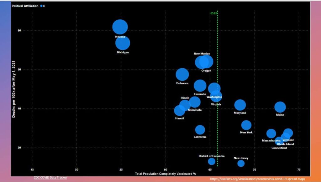
The 2nd image shows just the democratic voting states. Michigan and Nevada are well below average for vaccine rate, and they are well above average in death rates per 100k after the vaccine. Michigan is just a democratic state, so the data makes sense to me.
Republican Voting States Death Rate Per 100k
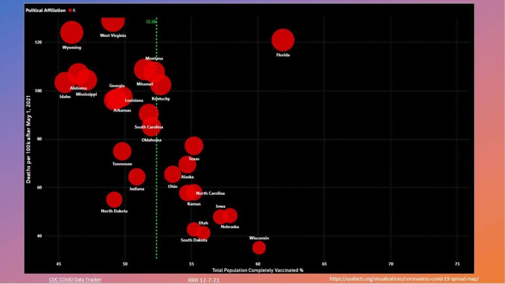
The 3rd image shows just the Republican voting states. Although Florida is well vaccinated, it’s an outlier for death rates after the vaccine. I hypothesized that the snowbirds were in their vaccine rates. Also, their Governor had feeble covid mitigation policies in place & executive orders that prohibited schools from doing what they needed to protect their children and families during the Delta Variant. It’s an example of what not to do during a Pandemic.
Republican Voting States Death Rate Per 100k before 5/1/2021 and after 5/1/2021
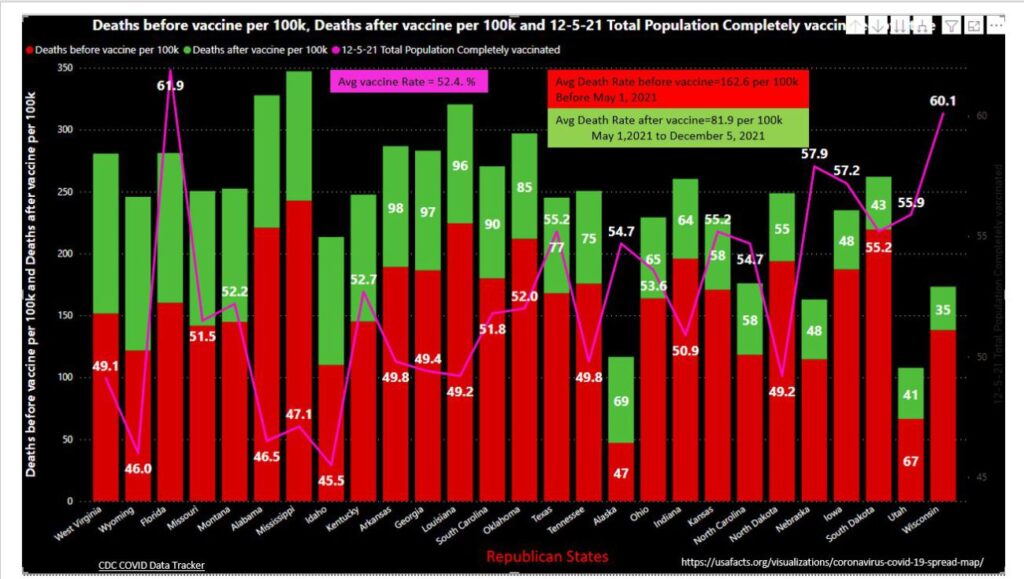
The 4th chart shows the Republican voting states death rate per 100k before 5/1/2021 and after 5/1/2021 (vaccines available) and the corresponding Total Population completely vaccinated as of 12/5/2021.
The Democratic Voting States Death Rate Per 100k Before 5/1/2021 and After 5/1/2021
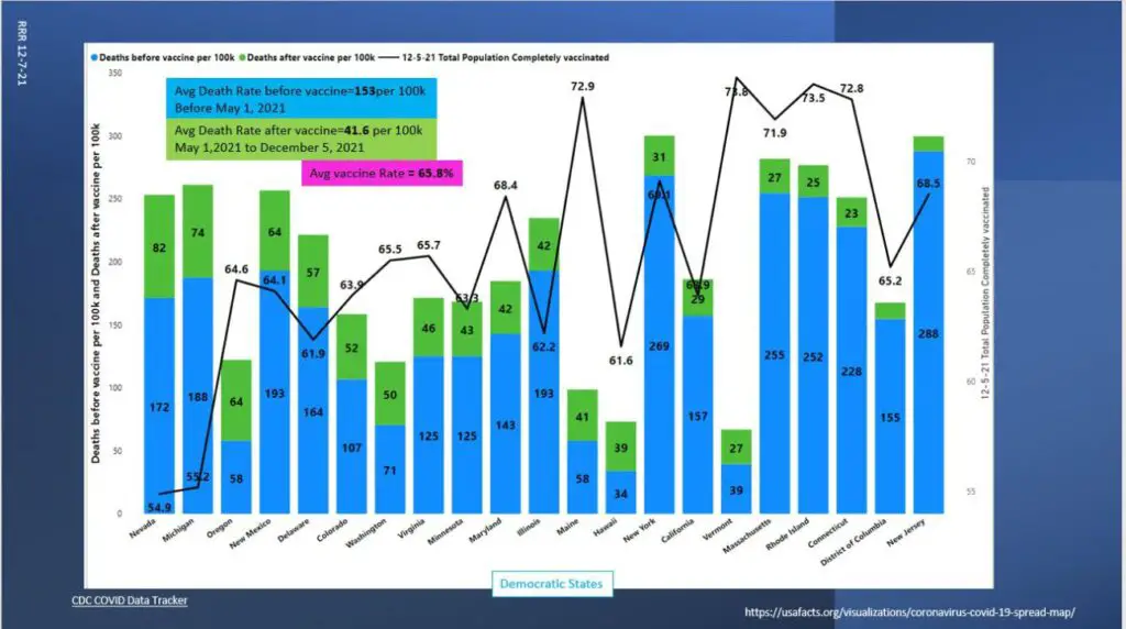
The 5th chart shows the democratic voting states death rate per 100k before 5/1/2021 and after 5/1/2021(vaccines available) and the Total Population completely vaccinated as of 12/5/2021.
Deaths Before Vaccine Per 100K Population – Democratic States

Deaths Before Vaccine Per 100K Population – Republican States
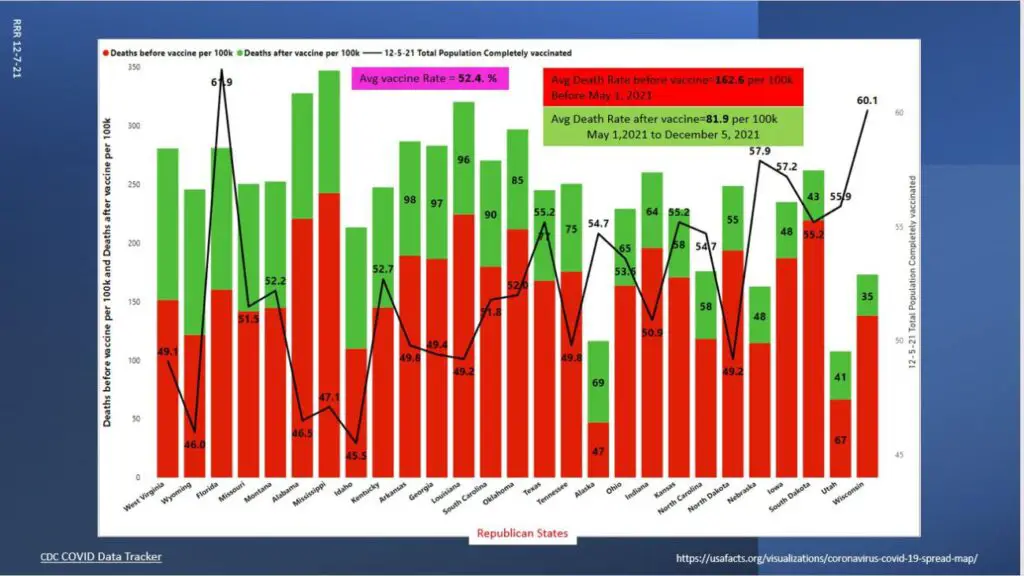
For charts 6 and 7, I call your attention to the text boxes at the top and the average death rates and vaccine rates, and the differences between these numbers on the corresponding charts. The green portions of the bars on both these charts are much more significant in the Republican voting states.
State Population Density Depicted – Deaths vs Compleaty Vaccinated
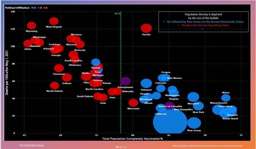
The Final 8th chart includes the state population density element. The larger the bubble, the more dense the state. Interestingly, the highest density states have the lowest death rates and highest vaccination rates. It is another indication of the effectiveness of the vaccine. Florida is the highest density Republican state. Most of the highest death rate states are the least vaccinated with the lowest density.
Conclusion
The data does not care or lie!
The higher population density should drive up the death rate. Still, because these states are the highest vaccinated, their death rates are lower, indicating how effective the vaccine is. The data shows the vaccines work. Get Vaccinated and get your booster shot.
Related Low Vaccination Rates and Covid-19 Reading
AAA Offers Interactive Map of 8 Types of COVID Restrictions In US and Canada
7 Simple Tips From a Doctor Who Survived COVID-19
6 Months of Pain – A Covid Long-Hauler Medical Journey
I Managed Surviving Covid 19, But It’s Still Affecting Me Six Months Later